Voters read the look of a sign before they read a word on it. A judge’s sign that looks like a monster-truck rally, or a sheriff’s that looks like a bake-sale flyer, sends a message the candidate never meant to send. So dress the sign for the office, the way you would dress for the debate.
Every look below is printed in full color, edge to edge, at the same price as one color. Every sample says YOUR NAME; yours will say yours.
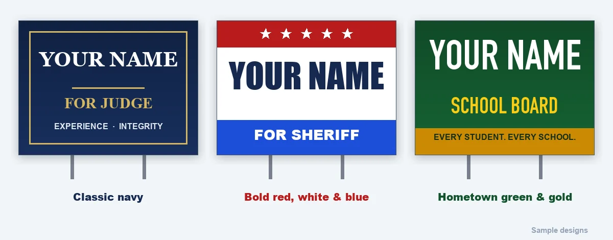
Judge, prosecutor, clerk, treasurer: classic navy
Restraint is the message. A navy ground, the name in a white serif, a thin gold rule, and the office in small capitals beneath it. Two words of slogan at most, and only if they are about the job — Experience · Integrity. No flags, no exclamation marks. The sign should look like the courthouse.
Sheriff, mayor, county executive: bold red, white and blue
Energy and authority. A heavy condensed sans for the name, as large as the board allows; a red band with a row of stars across the top or a blue band across the bottom for the office. Keep the flag elements at the edges, where they frame the name instead of competing with it.
School board, library, parks: hometown green and gold
Warm and local. A green ground, a friendly condensed sans in white, “School Board” in gold, and a gold band along the bottom for a three-word line. Use your district’s colors if you like, but leave its logo off unless you have permission in writing. More for school board races.
City council: civic and specific
Navy or your city’s own color, a strong sans or a classic serif, and the seat spelled out: “City Council, Ward 3”. Council races are won corner by corner, so this is the race where double-sided signs pay for themselves. More for council races.
Write-in: the band and the spelling
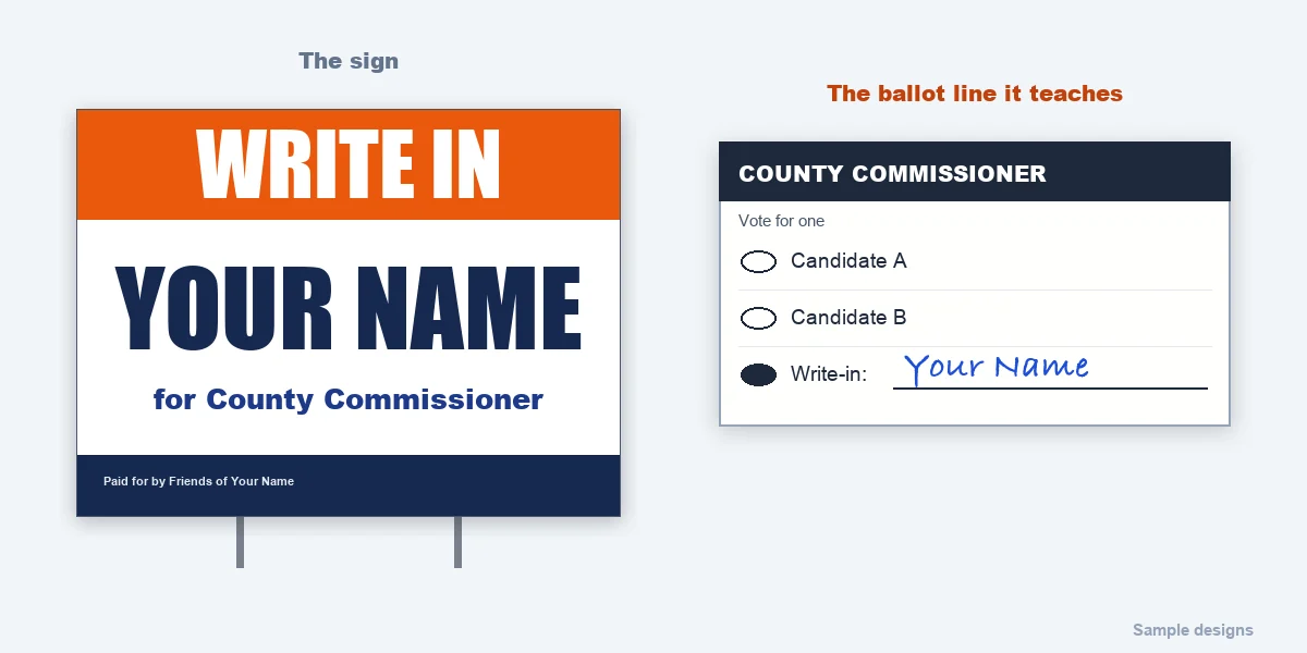
A write-in sign has a second job: teaching voters what to write. Put WRITE IN in a bright band across the top, the full name in large capitals in the middle, spelled exactly as it must be written, and the office below. More for write-in campaigns.
Ballot questions: the verdict in color
A measure has no face, so color does the work: a strong green for YES, a red for NO, the measure’s number or letter exactly as it appears on the ballot, and one plain line about what it does. More for ballot committees.
What stays the same for every office
- The last name is the largest thing on the sign.
- The office is one line, directly beneath it.
- Three words of slogan at most.
- The “Paid for by” line sits small along the bottom, in the wording your state asks for.
- High contrast, and a background printed all the way to the edge.
See yours in 20 seconds. Type the name and the office on our political signs page, pick one of these looks, and the AI designer draws three full-color concepts. A designer turns the one you pick into a print-ready proof, and nothing prints until you approve it.
Common questions
What colors should a campaign sign be?
Two or three, with strong contrast: a dark background, a light name, one accent. Pick them for the office: navy and gold for judicial and clerk races, red, white and blue for sheriff and mayor, green and gold for school board and parks. Full color costs nothing extra on our signs, so choose for the look, not the price.
Should I use my party’s colors?
In a partisan race, if they help voters place you, yes. In a non-partisan race — most school board, judicial and many city races — choose colors for the office instead.
What font is best for a yard sign?
A heavy sans serif for the name, condensed if the name is long, so the letters stay tall. A classic serif works for judicial and clerk races. Avoid script and thin type: they disappear at 40 feet.